SharePoint 2010 introduces the ribbon bar as a central place for all the editing controls, that in earlier versions could be scattered across the page.
When designing custom master pages for SP 2010 you may want to visually integrate the ribbon bar into the design, as is done in the out-of-the box v4.master (wiki & workspaces) and nightandday.master (publishing portal) pages.
To do this, I have documented the size of the different elements, so they can be included in the design.

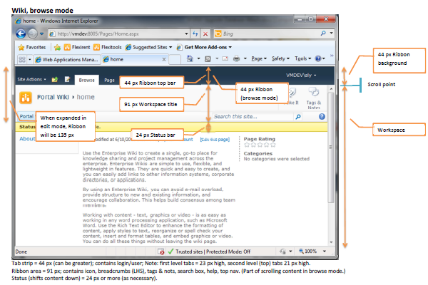
The out-of-the-box master pages include a fixed (non-scrolling) header at the top, and then the main content in a (scrolling) workspace below that. In the v4.master, used for the Enterprise Wiki, Team Site, and other collaboration spaces the header only contains the ribbon top bar, which is 44 px high in browse mode.
 In edit mode, the ribbon expands to 135 px, pushing the rest of the content down. The out-of-the-box nightandday.master, used by the Publishing Portal, also has as 60 px top row above the ribbon. The top row and ribbon top bar have the same background so they visually appear to be a single header section.
Note the placement of the login/user control and tags & notes, plus the placement of the search box and breadcrumbs. All these elements usually appear near the top of the page and there is some room available on the right hand side of the ribbon, or they can be placed in the top row.
Both of the out-of-the-box master pages have a title section at the top of the main content which is hidden when the ribbon tab is displayed. This title is the same size as the ribbon (91 px) so it looks as if the title area has just been replaced with the ribbon tab and the rest of the page stays where it is, instead of jumping around when switching modes.
Note that you do not have to follow this design – you can simply stick the then ribbon top bar at the top of an existing page and have the ribbon tab push down the rest of the content when it appears – but having a visually integrated ribbon can improve the user experience.
The different appearance with and without the ribbon tab can be seen in the following wiki screens. Note the location of the scroll bar in the different modes.

Also note the location of the status bar. This is immediately below the title section, which means it appears at the very top of the scrolling workspace in edit mode. The status bar is usually 24 px high (although it can vary in size depending on content) and does push the rest of the page down.
Similar screens for the publishing portal are shown below as well as the anonymous user view (not logged on).
 The out-of-the-box publishing portal top row has room for a 60 px high logo image. The enterprise wiki master page has a similar amount of space with the top menu inside the title area leaving 64 px room for a logo, however the table cell that contains the logo has 10 px margins top & bottom, leaving only 44 px for the image (unless you change the CSS).
Putting it all together, to cleanly integrate the SP 2010 ribbon into your site, your design should take into consideration space for the 44 px top bar and expansion of the ribbon tab to the full 135 px ribbon, as well as room for a matching 91 px title area that can be hidden and a 24 px+ status bar.
 A good starting point is the Starter Master Pages available on Codeplex.
Download this guide as a stand-alone file:
- SP2010-Design-Considerations.pdf (pdf, 516 kB)

I found many ways to hide various out of box controls like quick launch, ribbon, top bar etc on SharePoint page. But not all the solutions feasible in all the scenarios. Most of you experts are aware to implement this using the CSS styles. I am just collating the possible solutions at one place which I hope will be beneficial to make the choice of adopting suitable solution.