
So, usually I blog about technology, but it's about time I added a bit of social commentary.
A cool feature of the recent Australian Federal Election was the ABC Vote Compass. Here it is, showing where the major political parties are placed:
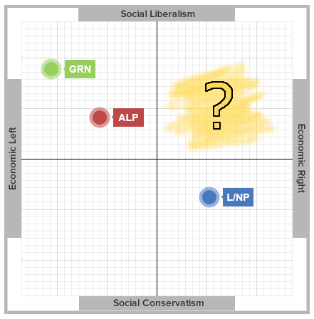
This concept, of plotting both the economic and social position of politics, has been around for a while, e.g. the Political Compass or Political Quiz (note: both of these have the Y-axis the other way around, so you have to swap top-bottom to compare to the ABC Vote Compass).
It also shows why none of the major Australian political parties are a good fit for me -- I want a mix of the economic right AND social liberalism, I want the social policies of the Greens / Labor, and the economic policies of the Coalition.
The positions of the major parties is something I could never quite understand: why is social liberalism so connected to the economic left, and why is the economic right (economic liberalism) so connected to conservative social policies?
That leaves me to turn to minor parties such as the Liberal Democratic Party (LDP), often with below the line voting (and wishing we had above the line optional preferences).