Although ABC Vote Compass probably has the highest number of users, it only shows a limited number of parties and there are a few alternatives now available.
The most comprehensive so far seems to be Smart Vote, which has invited a much broader set of parties to answer their quiz. Others include Political Compass, iSideWith, and How2Vote.
SmartVote
https://australia.smartvote.org/
Affiliated with the Australian National University and available via the Sydney Morning Herald and the Age.
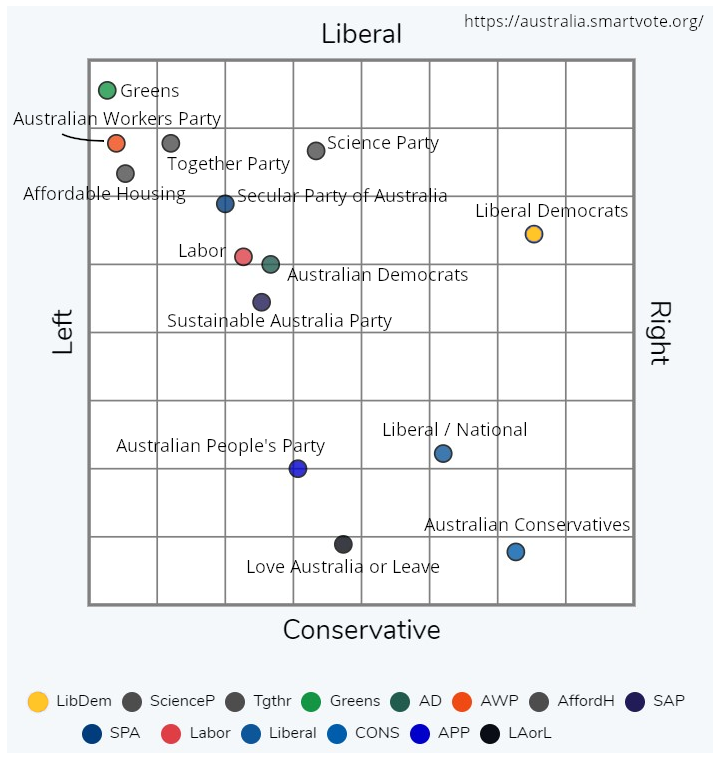
A series of 35 questions, for either the House of Representatives it matches you to the specific candidates in your electorate, based on either personal or party answers, as well as showing them on the above map.
For the Senate, for your State, it matches you to either individual candidates (below the line) or parties (above the line).
You can also drill down to individual candidates and see a spider map of the six topics: Inclusivity, Economic Liberalism, Law & Order, Traditionalism, Welfare State, and Environmental Protection, and also compare your specific answers to the party or candidate responses.
Note: The map above was taken mostly from the NSW (who had the most) party results on 2019-05-05, adding in the Secular Party (from the Victorian results). The map for any particular state will only show the parties in that state.
Political Compass
https://www.politicalcompass.org/aus2019
The Political Compass provides a global perspective, as they cover not only Australian elections, but other countries as well.
A longer test than others, the Political Compass is not country or election specific, so won't cover local topics, but be based more on overall philosophy. The 2019 Australian Federal Election compass includes more parties than previously, which is good to see.
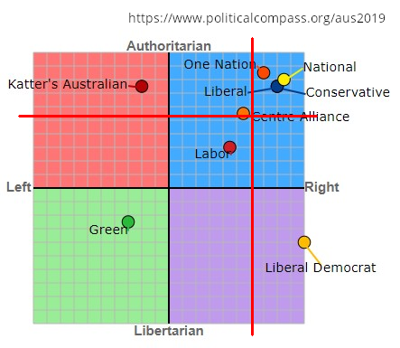
Notes: An important note is that the Y-axis in this graph is the opposite of Smart Vote, with social progressive (labelled 'libertarian') at the bottom and social conservative (labelled 'authoritarian') at the top.
The labels Right (free markets) and Left (government control) also refer to economic position only.
The other thing to note, is that normally an Australian chart will have the centre be between Labor and Liberal, however on a global scale both are pretty economically right-wing.
The usual Australian axes have been added (the red lines) to make the chart easier to understand, with Labor/Greens in one corner, and Liberal/National in the other.
iSideWith
https://australia.isidewith.com/
This appears mostly a USA-focused site, opening up to Australia in 2016.
Questions start off with a limited set on different topics, but you can expand to show more questions and go into more detail. Some of the question wording shows the USA heritage (e.g. "Charter Schools").
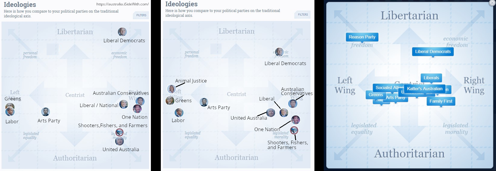
The main results are your percentage match with parties, but if you scroll down there is a lot more detail, including parties by issue, the ideology map, political themes, and comparing results to friends.
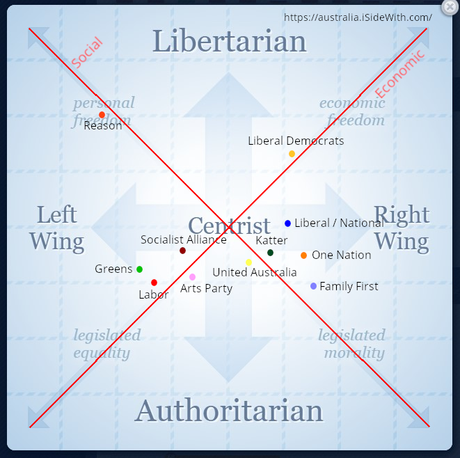
Note: The graph uses the Nolan Chart configuration, which is turned 45 degrees anticlockwise, so that the axes are on the diagonal.
You need to tilt you head to see the usual diagonal spectrum (now horizontal) running from Greens/Labor to Liberal/National.
Technical and content issues
iSideWith has a large range of features, but a lot of them don't seem to work so well on the Australian site.
The results are also confusing, depending on which way I click I can get two different sets of party percentage matches, and three different maps of where the parties sit on the ideology (see above).
The latest one I found has the most parties, but is impossible to read with the overlap. I used it for the main graph, but edited it to clearly show the parties.
Another example, to save your results, the login for Australia doesn't work; however you can go to the US site, log in there before you do the test, and then your cookie is transferred to the Australian site, preserving your results.
There are supposedly candidate logins and support, but they don't work for Australia either.
Some of the content is still outdated, e.g. referring to the 2016 election, or still showing parties such as Family First that no longer exist. There is also some content that seems to be from the 2019 NSW election.
There are also many menu headings or links that are broken and don't work.
iSideWith is useful, and shows a lot of promise, but currently it is mostly just a mess.
How To Vote
This quiz is based off the data from theyvoteforyou.com.au, and so is based off actual voting records, rather than just political statements.
There are some drawbacks to this, such as only having answers for parties who already have elected members.
Also, the way that particular amendments or bills are worded can sometimes result in a misleading implication of a party position, but overall depending on actual voting record is a pretty solid basis.
There is no statistical analysis of the results, so no map or graph, only a percentage agreement with parties or politicians.
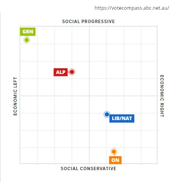
ABC Vote Compass
https://votecompass.abc.net.au/
ABC Vote Compass, produced by Vox Pop Labs in conjunction with the University of Melbourne, is the most established of the quizzes, and generally has the most users.
It has a well developed statistical methodology, that has improved over the years, but is probably getting too complicated for it's own good.
The tight selection criteria also mean that it only shows a limited number of parties, previously only ever 3, and only expanding to a 4th party this year. This leaves a lot of people, who might not align with any of the major parties, out in the wilderness.
I suggest use SmartVote instead.
One thought on “Political quiz alternatives(5 min read)”