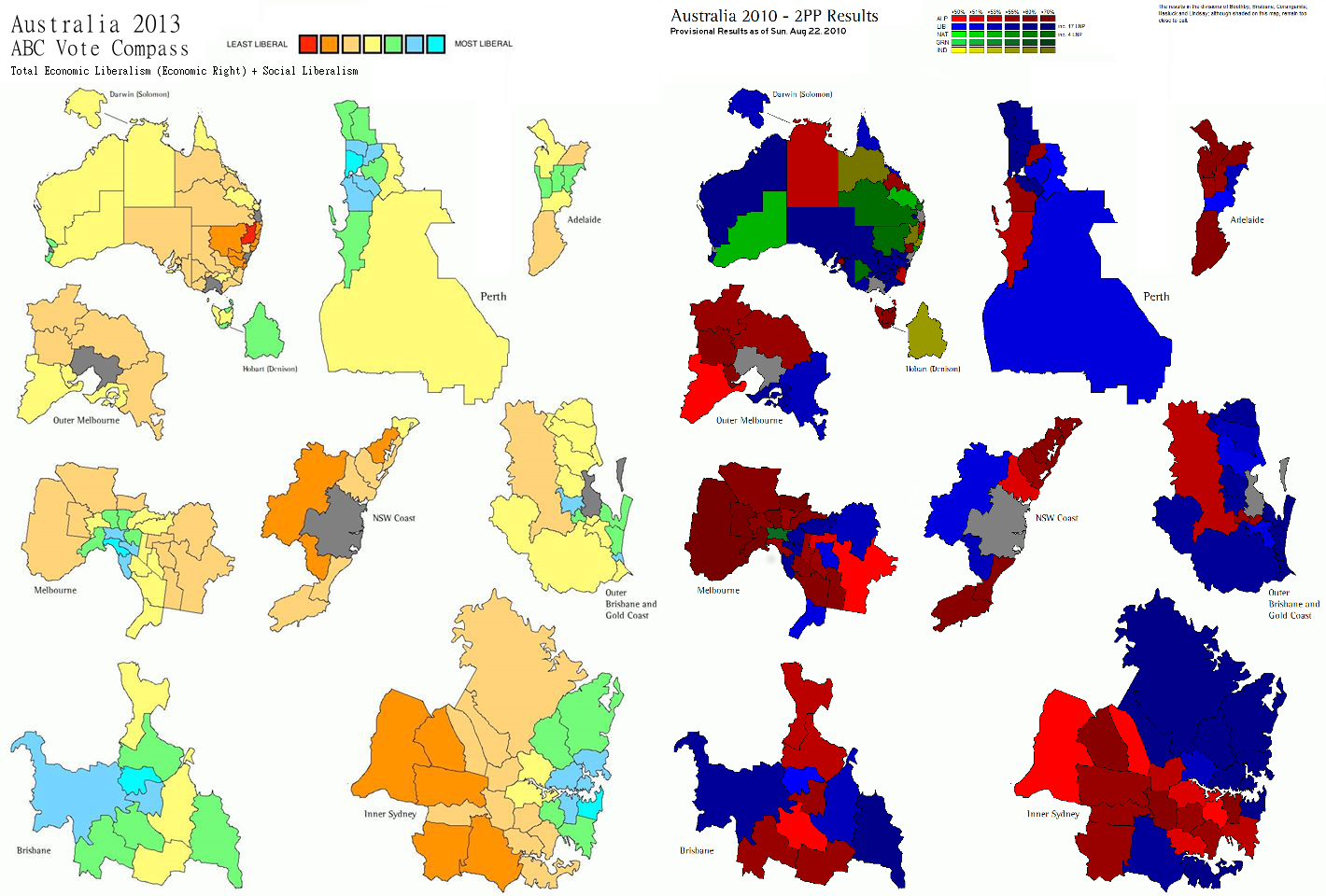
Based on the liberalism index (freedom-leaning vs control-leaning) from the ABC Vote Compass data, Jack Mackay (https://www.facebook.com/jack.mackay.378) has created a map of the electorates coloured by their rank on the liberalism index.
For contrast I've included the original map, with colours by political party (although from an older source, for the 2010 election).
To me, at least, it appears that the liberalism index has a lot more geographical coherence, with a clear correlation pattern from inner city outwards.
In contrast, the distribution by voting party seems a bit more haphazard.
e.g. Compare the detailed maps of Sydney and Brisbane -- coloured by liberalism index they both appear fairly similar radiating out from the center. A similar pattern is seen in Perth, Adelaide and even Tasmania.
Brisbane looks a bit strange until you look at the larger map and realise that the green in the bottom right is actually the edge of the Gold Coast. If you treat Brisbane and Gold Coast as two separate cities, then both have liberalism decreasing as you move away from the center.
This patterns seems to appear irrespective of party votes, e.g. in Sydney both north and south show decreasing liberalism as you move away from the city centre, yet opposite party voting patterns.

